Livinleaf Wordmark

Logo, Typographical Design, & Publication Design
The intent of this project was to use typographic theories, principles, and characteristics to develop a Wordmark for a mock plant magazine publication. Starting with an already established typeface, this project transforms ordinary typography into a communicative mark of identity for household greenery, combining elements of lifestyle and science. Mock spreads of the publication are included to visually represent the essence of the wordmark.
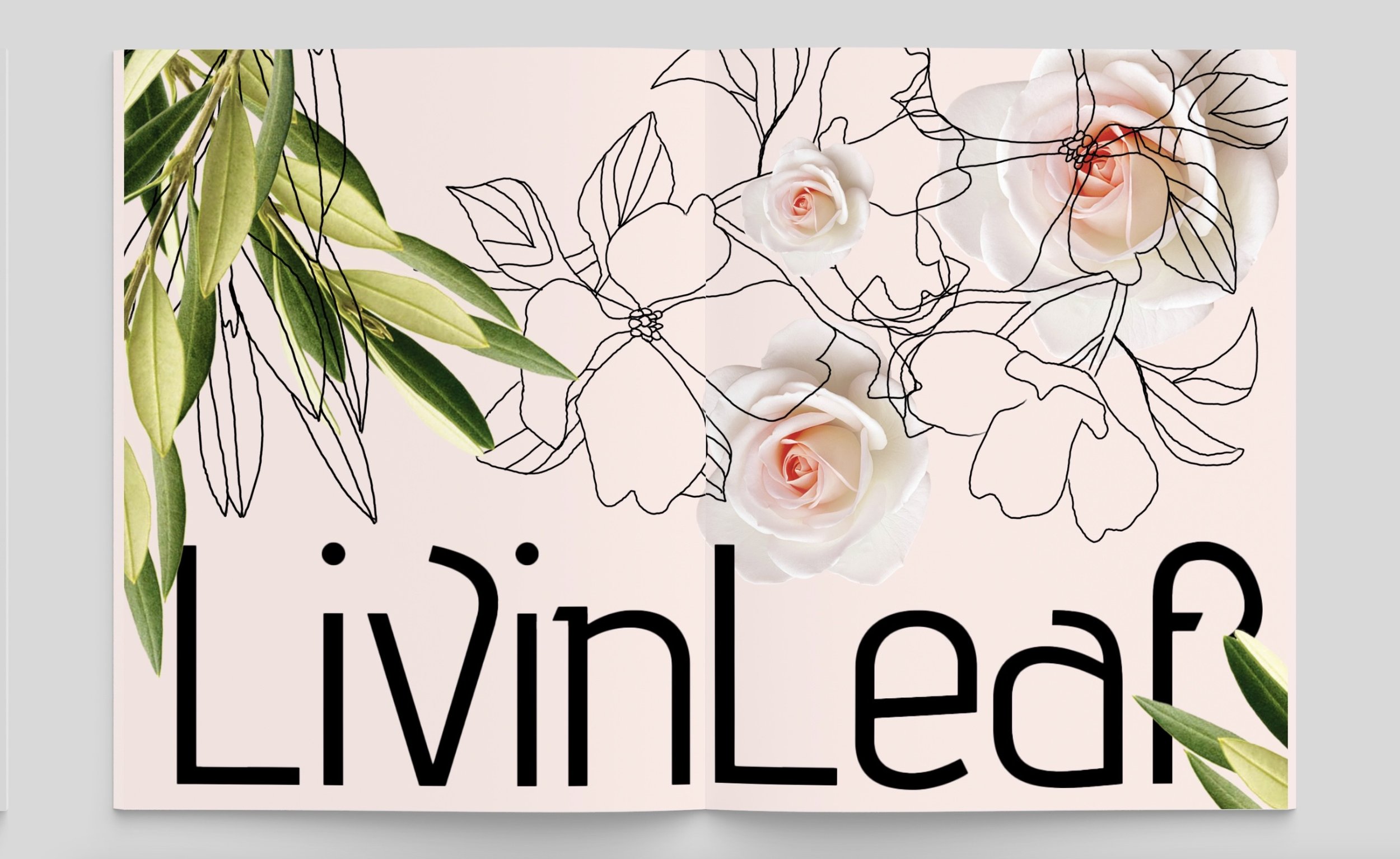
Mock publication spreads:

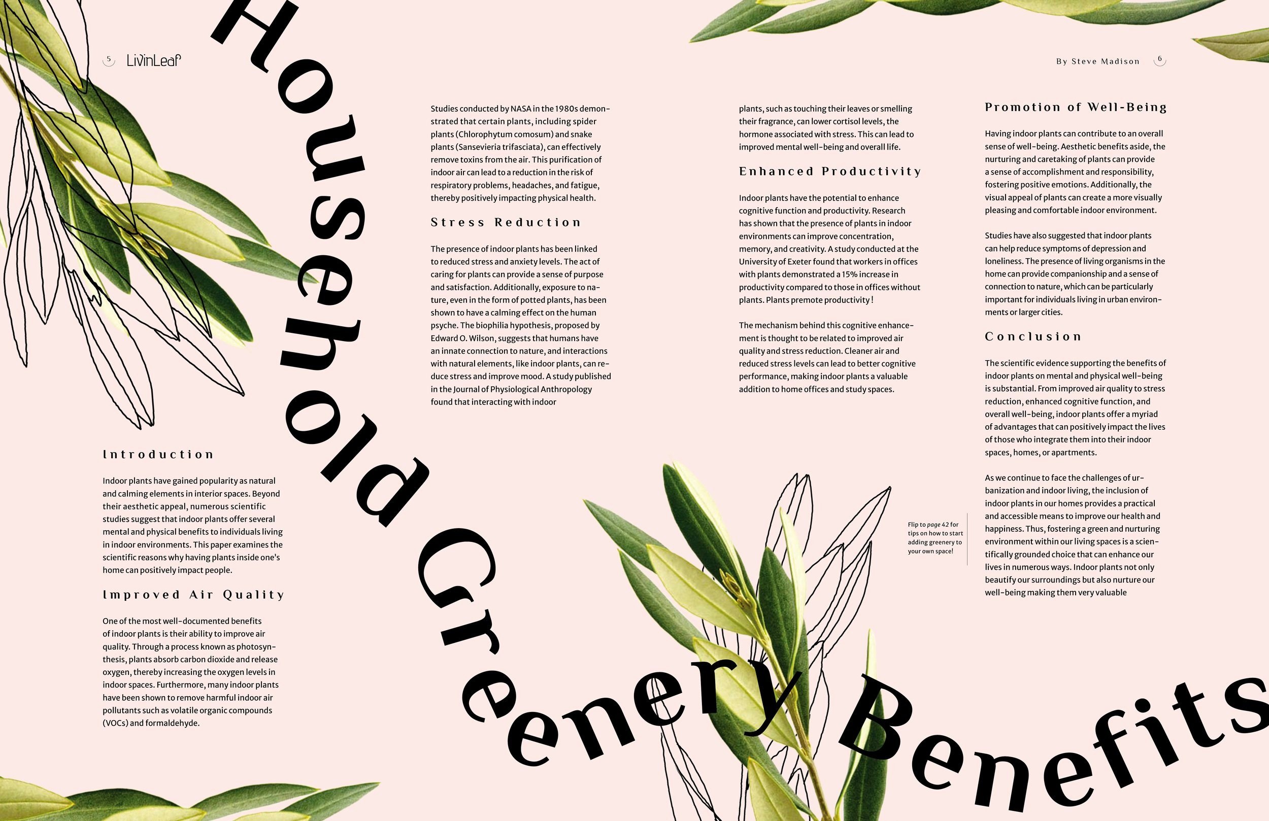
Science reveals numerous mental, physical, & emotional benefits of indoor plants. This publication helps young adults explore greenery while decorating their spaces.
LivinLeaf is a fragrant, organic, and biological exploration that embarks on the benefits of household greenery.
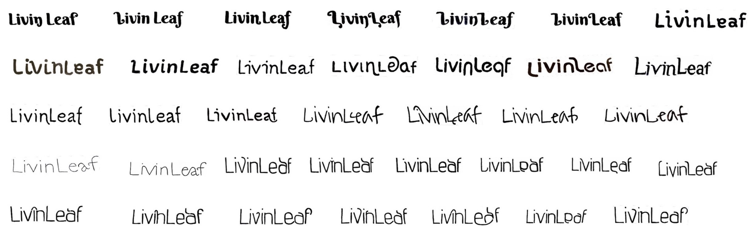
Wordmark Sketches
After selecting typefaces that aligned with my buzzwords and concept, I began manipulating the typographic elements to further emphasize the desired tone and vision for the publication. My goal was to strike a harmonious balance between science & lifestyle.
My final logo sketch, built on the Advent Pro typeface.


Design Attributes: trajectory, orientation of angles, rhythm, angled extensions, tight kerning & tall X height
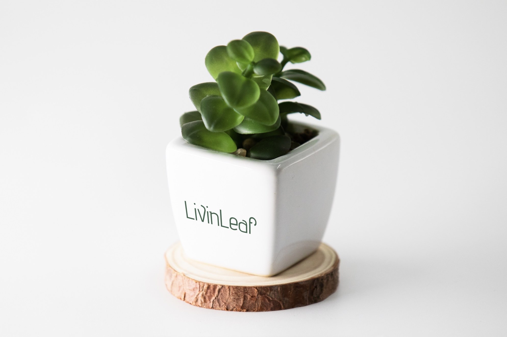
Mock Applications of the Wordmark

Final Vectorized Logo

Publication Iterations